A user-centered, ultra-readable site is key to success.
When the emotional stakes are high, your site’s readability and accessibility are the keys to a successful user experience and conversion. How important is a smooth, purposeful online experience for your brand? Imagine this.
You’ve just gotten home from taking a family member to the hospital. They’re staying overnight for observation. You know they’re in good hands, but you want to see how much their treatment may cost and whether the stay is covered on your health insurance. So you take out your mobile phone, tap your way to your insurance provider and … what happens?
If frustration was your first instinct, you’re not alone.
Nowhere is a smooth, reassuring web experience more important than in high-need, high-touch environments. Think healthcare. Maybe government agency sites. Or social services or just about any other category where your audience arrives full of questions.
When your users arrive, they have limited time, they’re typically under a lot of stress, and they may not even be completely clear on what it is that they’re looking for. As a service provider, you’re responsible for creating a welcoming environment that helps the user find the answers they need.
First things first. If you’ve taken the six UX/UI steps to make your website more intuitive, you’ve already got a head start on the competition.
Now, let’s take a look at some best practices for understanding your user experience, then making quick, high-impact changes to power up your web presence right now.
Re-examine your audience.
You should always be learning about your audience. So pull out the user personas you built when you first designed your digital product and align them with actual user data.
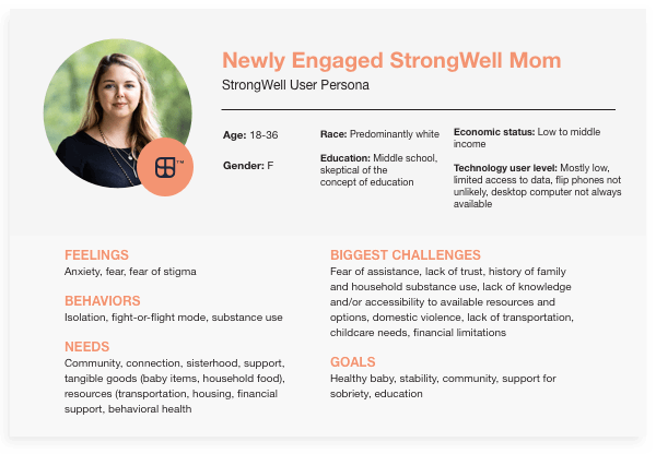
Do those personas still apply? Are your users behaving as expected? Their needs are constantly changing. The more you learn, the more you can understand their points of view and know what needs to change when they visit online.
Now, dig into Google Analytics to learn more about your audience and how they use your website. You should have enough data to pull user behavior on your website about six months in—depending on the type of business you have and the number of visits your website gets.
Do this.
If you’ve got a digital strategist in place, that person should be your go-to for these insights. On the other hand, if “digital strategist” is just another one of the many hats you wear, Google’s Google Analytics for Beginners is invaluable.
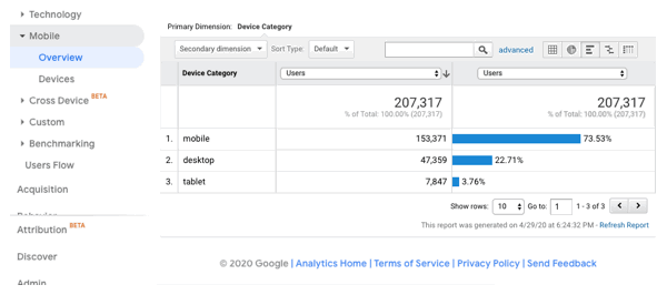
What devices are my users primarily using?
Your users expect a welcoming, easy-to-navigate web experience no matter where they are or what device they’re on—not to mention which OS and browser they’re using. So understanding your users’ device usage when they come to visit is crucial in order to provide the most intuitive user experience possible.
Do this.
If you find that 80 percent of your users are on mobile devices, make sure your content is easily viewed on mobile versus desktop. Design and write for mobile first. Which means shorter content, larger font sizes, left aligned text, and simple, intuitive navigation.
Is a potential bad user experience causing my users to miss out on content?
When you dig around in Google Analytics, look at the pages with high bounce rates. Use a tool like hotjar to evaluate user behavior using heat maps. This will give you the insight you need to see where users click and how far they get down the page of your website before bailing.
Evaluate the content on the pages with high bounce rates against user behavior. What is missing? Is the web page mobile-friendly? Does it follow accessibility guidelines?
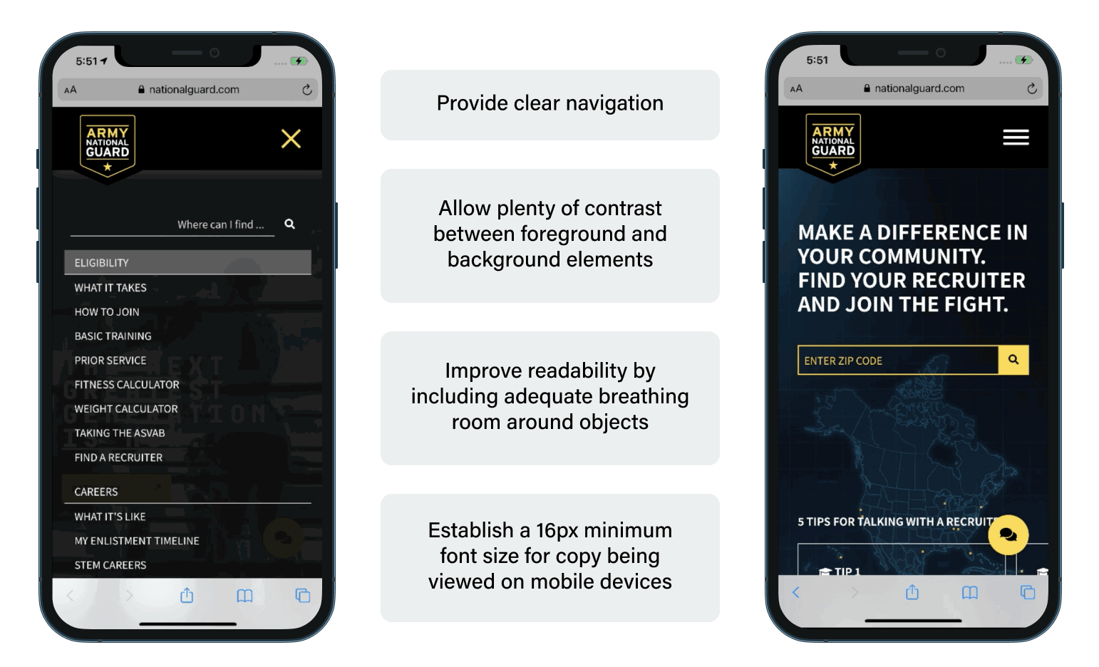
Here are some examples of easy tweaks that you can make to improve the user experience on a web page quickly:
Now that you’ve made your user’s experience as smooth and intuitive as possible, let’s see how some straightforward content work can further improve the user experience.
Evaluate key pages for easy readability.
Think about every piece of guidance you’ve ever heard on website copy. “Everything should be written to a third-grade level.” “Always avoid technical terms.” “Never have sentences longer than 20 words.” “Pages should never have more than 300 words. Or maybe it’s 200?”
Great web copy balances strict “rules” about copywriting for the web with what you know about your audience and the needs that bring them to your site.
The intent of all this guidance is sound: Make your site as easy to read and navigate as possible. But if you simply try to hit a series of numbers or trick search engines into ranking your pages higher, they’ll begin to lose their humanity. And, in healthcare or government service, being accessible and empathetic to your audience is absolutely critical. Site exits will climb. Eventually, Your pages’ search rankings will languish.
Use a tool like Readable’s text scorer to evaluate copy on your key pages. Readable scores your copy using 11 different methods to give you a good idea of how easy it is for people to understand what’s on a page.
Here’s an example. We used the tool to evaluate copy on a single page of CMS.gov. It’s the official site for Medicare information.
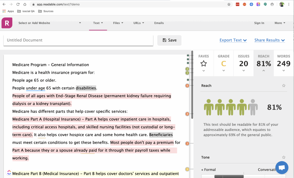
Overall, not too bad. But we were interested in what tweaks we could make to the copy alone to enhance its readability. So in Readable’s text window, we made some simple changes that didn’t change the meaning of the copy but made it much easier to consume.
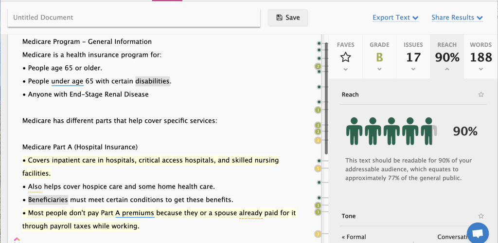
What changed?
- Added bulleted lists.
- Included some short introductory sentences to introduce the lists.
- Found appropriate places to address the user directly using “you” and “your.”
- Cut about 50 words (which we made sure weren’t important to search results).
The whole process took about 15 minutes. With just a few tweaks, improved the copy’s readability substantially without needing to make any design or user experience changes.
Do this.
If you can do nothing else to your site because you’re short on time or resources, evaluating your top 10 pages for readability and making simple copy updates is a great first step. With monthly subscriptions to Readable starting at just $4.99, it’ll more than pay for itself in increased conversions.
Improve accessibility now.
The World Wide Web Consortium’s Web Accessibility Initiative (WAI) has provided concise guidance for content creators since 1997. So whether you’re a writer or a designer, there are fairly straightforward copy modifications and web design updates you can make to your site to increase accessibility for users with disabilities.
While the UI for the WAI’s Resources for Content Writers is spartan, the guidance there should sound familiar to anyone who’s ever written effective web copy. A few jump out immediately:
- Provide informative, unique page titles
- Write meaningful text alternatives (alt tags) for images
- Keep content clear and concise
– Writing for Web Accessibility, accessed 28 April 2020
Sounds an awful lot like writing pages to SEO best practices, doesn’t it?
Do this.
Start with your site’s five most trafficked pages. Use Moz.com’s Page Title and Alt Text for Images, and follow Readable’s guidance to update the text on those pages. Plan on spending about an hour per page. Just focusing on your most visited URLs will help your users tremendously. And you’ll likely see traffic increase.
Besides the fact that it’s the right thing to do, making your site highly accessible ensures that your customers, clients, patients or shoppers with disabilities can complete their missions as easily as people without disabilities.
Here’s the thing. Just like the principles of universal design have resulted in safer, easier to understand interior environments for people of all abilities, web accessibility makes better sites. They’re easier to navigate, and they make it easier to find what you need even when you’re not quite sure what that is.
Now is not the time to rest.
The COVID-19 outbreak has resulted in thousands of businesses putting major website rebuilds on hold. But you can use this time of uncertainty to your advantage. You can make fixes that will position you to leap ahead of the competition.
And if you’re one of the countless brands delivering vital healthcare and services to people who need quick access to easy information, there’s never been a more important time to deliver.
No matter the scope, optimizing your digital properties to welcome visitors is both art and science. If you’re looking for guidance on how to improve your site’s usability and readability, drop us a line.

Brandi Leath, User Experience Director
Brandi Leath is Director of User Experience at iostudio. As our UX/UI expert, Leath has a gift for understanding user motivations and behaviors. From websites to apps and beyond, her intuitive designs empower clients to engage their audiences in bold new ways. Very simply: After Brandi touches something, it’s better, clearer and easier. (Even her spreadsheets are user-friendly.) She’s passionate. About life, good UX, and working with clients who make the world a better place.

Web Webster
Web Webster is iostudio’s Associate Director of Content. He has more than 25 years of experience in content strategy, writing and client service for health care, financial, tech, tourism, B2B and consumer brands. He’s a book lover, runs slowly, makes metal sculpture, and loves puns. His closest brush with fame was in high school when he was in English class with Ashley Judd and doubled on a sled with her sister Wynonna the same winter. He’s been chasing that fame high ever since. He and his wife Ashley (not the actress) have two kids.